|
Last week all three Grand Challenge groups presented their problems. Each group had 12 minutes to fully describe their projects including the global scope, prior work that has been done, and potential opportunities. This was a difficult task because it meant, for example, that I had 4 minutes to describe what is driving pollinator decline (land-use, pesticides, biological interactions, and climate change). We received important feedback on the presentation: be very sure about where our figures and data are coming from and to more critical about the data we rely on. We were told not to spread figures that are meant for "shock". The three of us were pretty disgruntled by this comment and this blog is meant as a response to and discussion of the feedback we received. The offending image: 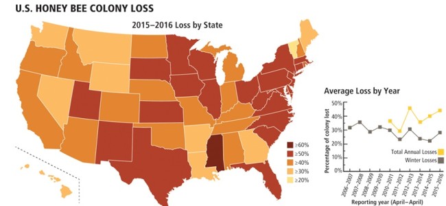 The source, is Discover magazine, reprinted from the Bee Informed Partnership: https://www.discovermagazine.com/planet-earth/honeybee-survival-is-in-jeopardy There is huge fear in America right now about the spread of mis-information and simultaneously it is true that scientists need to be very careful about their sources. We should be very sure about the ideas we choose to adopt, build on, and spread.
But I also think that when people see data (like the image above) that is scary, they can react in unpredictable ways. Yes, the data above is scary. It shows that in some parts of the US in 2015-2016, honey bee colonies lost more than 50% in a single year. This is just a small piece of the pollinator decline that our group has been learning about. Another important piece here is that there are always issues with visual display of data. For instance, the image above spreads out the data for honey bee loss by state. Perhaps there were only a few locations in Mississippi with extremely high bee loss, but the map makes it seem like the entire state is facing huge bee losses. On the other hand, the map makers may have had a very good reason to display the data in this way. Perhaps it makes the most sense to implement regulations for honey bees at the state level, in which case, state-by-state comparisons are most applicable. The argument presented during the presentation was that there are huge inconsistencies in the rate of loss even for states right next to each other. This seems improbable and likely means that this map was specifically designed to make people worried about this issue, shocking them into action. Our response at the time was that honey bees are shipped to pollination locations all over the country, so it actually is feasible that two neighboring states could have drastically different loss rates. Human bee management/use interferes with the usual smooth distribution that one might expect for this type of data. Now let's get back to the Bee Informed group that produced this data. I could not find the original data on their website that was used specifically for the Discover Magazine map, but I would encourage readers to go to their interactive map with state by state honey bee loss annually. Maybe play around with the 2017-2018 map to see 3 states with losses over 60%. Overall, I do not think it was inappropriate to use the map in question in our talk. Data from the Bee Informed Partnership (with supporters like the USDA and the National Institute of Food and Agriculture) supports data we found in many other studies. That honey bee losses in the US are substantial and scary. That the problem is very complex with many interacting factors that make it hard to determine a cause. That sometimes a shocking figure is important to use because it is true and because it catches the audience's attention.
0 Comments
|
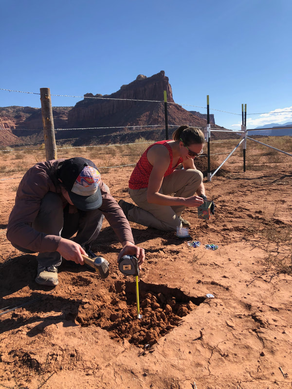
AuthorSierra is a graduate student in the Barger Lab at CU Boulder studying microbial ecology for dryland restoration. Archives
August 2023
Categories |
 RSS Feed
